Case overview
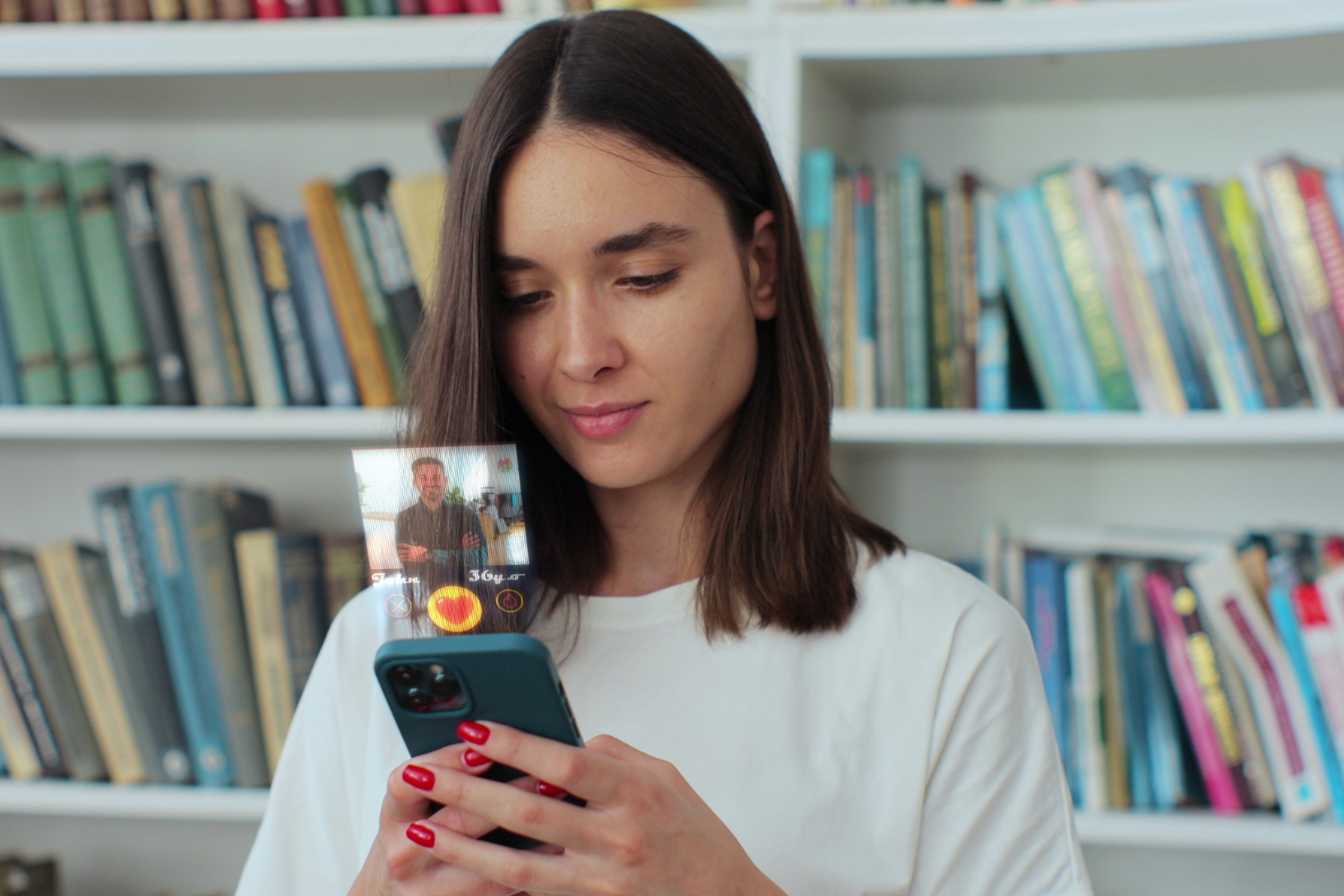
Crush presented us with the exciting challenge of creating a dynamic platform for connection, designed to stand out in the crowded digital dating scene. Our goal was not only to build an application but to craft a unique space where interactions are fun, safe, and lead to more meaningful connections.
We embarked on creating an inviting and engaging brand identity for Crush. The design system established was vibrant and fresh, resonating with the young and spirited demographic. Every visual element was thoughtfully chosen to reflect excitement, connection, and the thrill of newfound romance.


The Brief
The culmination of our efforts resulted in a platform that’s not just functional but also exciting and meaningful to its users. Crush has since reported a significant uptick in active users, successful matches, and positive reviews, cementing its place as a formidable contender in the digital dating space.

Our Approach
Branding & Design System: We embarked on creating an inviting and engaging brand identity for Crush. The design system established was vibrant and fresh, resonating with the young and spirited demographic. Every visual element was thoughtfully chosen to reflect excitement, connection, and the thrill of newfound romance.
Brand Strategy: Our comprehensive strategy involved positioning Crush as not just a dating app but a community. We focused on highlighting the ease of finding genuine connections, underpinned by a narrative of flirting with freedom and dating with confidence.
Web Design: The website was crafted to mirror the app’s vibrant energy, serving as an informational hub and a teaser of the app’s exciting features. Interactive elements and a clear user journey were implemented to encourage sign-ups.
Web Development: Robust and responsive, the website was developed to ensure seamless functionality across devices, optimizing user experience while maintaining high performance and security standards.
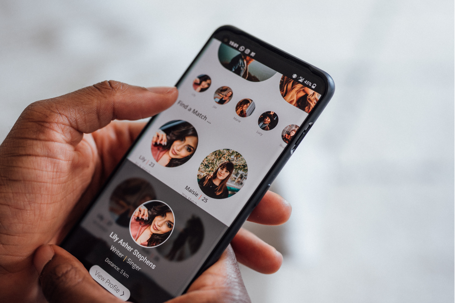
Bespoke Mobile App: We built an application that’s intuitive and fun. Features were designed with the user’s journey in mind, from creating profiles to engaging with others, ensuring a seamless and enjoyable user experience.
Matchmaking Algorithm: At the heart of Crush lies the matchmaking algorithm, designed to foster meaningful connections. It goes beyond superficial swipes, offering matches based on shared interests, values, and preferences, revolutionizing the way users experience online dating.
Real-time Chat: Communication is vital in the realm of digital dating, which is why we integrated a real-time chat feature. This allows users to engage instantly, breaking the ice and building connections in the spontaneous and thrilling way modern dating demands.


The Results
Post-launch, Crush experienced a remarkable surge in user acquisition, with a 50% increase in sign-ups within the first quarter, a testament to the app’s appeal and the effectiveness of the brand strategy. The intuitive matchmaking algorithm proved to be a game-changer, with a 70% increase in user matches, leading to a significantly higher user engagement rate.
User retention saw substantial improvement, with a 40% decrease in churn rate as users found real value in the app’s ability to foster genuine connections. The real-time chat feature, in particular, received high praise for its functionality and user-friendliness, leading to a 60% increase in daily active messaging.
The website served as a powerful conversion tool, with a 35% increase in traffic transitioning from the website to app downloads, highlighting the success of the seamless digital journey we crafted between platforms.
Additionally, the vibrant design and secure user experience led to a flood of positive reviews on both the App Store and Google Play, enhancing the app’s reputation and organic reach. The app’s rating averaged 4.8 out of 5, with users frequently citing the enjoyable user interface and the effectiveness of the matchmaking algorithm.
